DAX: Date Calculation Tables

Some time ago, I blogged about using a date calculation dimension in a multidimensional cube, and how easy it makes doing time intelligence in a multidimensional model. 2014 seems to have started out as “the year of Power Pivot”, as it is definitely gaining traction with my clients and more and more of them are asking about it during engagements. One of the absolutely amazing things I get absolutely giddy about in Power Pivot is the concept of disconnected slicers. As Rob Collie best said, disconnected slicers in Power Pivot are pure magic. I particularly enjoy the “mad scientist” reference he makes. For those unfamiliar, a disconnected slicer is a piece of data that has absolutely nothing to relate to in your data, but you want to use it as a part of your analysis. For a great introduction, see Rob’s Power Pivot pro blog about it as an introduction. I was recently showing a client this mad scientist level stuff, but then took the natural progression and thought: “If I can do this to control the number of months back, can I take it a step further and create a date calculation dimension like in multidimensional too?” What, that wasn’t the first thing you thought too?

First off, let’s create some measures in Power Pivot that contain our measures and time intelligence analysis:

image

For this post, I’ve created 4: Total Sales, Calendar YTD Sales, Previous Period, and previous period diff. These are typical time intelligence functions, nothing overly special or different that I did on them. If you’re interested, these are the formulas for them:

Total Sales:=SUM([SalesAmount])

Calendar YTD:=TOTALYTD([Total Sales],’Date'[FullDateAlternateKey])

Calendar Previous Period:=CALCULATE([Total Sales],DATEADD(‘Date'[FullDateAlternateKey],-12,MONTH))

Calendar Previous Period Diff:=[Total Sales]-[Calendar Previous Period]

Not too bad, yet. Ok, let’s create a table to house our disconnected slicer. In Excel, create a table with the value you want to select and an “ID” column next to it:

image

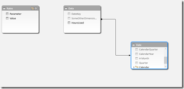
Then, add it in to your data model, either by copying and pasting or clicking the “Add to Data Model” link in the Power Pivot ribbon. Below is my Power Pivot diagram view after importing, notice how there is no relationship between the date calculation table and the fact table:

image

Getting back in to the data view, we’ll navigate back to the fact table, and take the same approach as Rob did for his disconnected slicer to return the currently selected slicer:

Date Calculation Selected:=MIN(‘Date Calculation'[Value])

In the preceding formula, we’re taking the min value of the value column of the date calculation dimension. This allows us to then select the current active context inside of our pivot table. In the below image, I’m selecting the measure value from disconnected slicer table I created, and the Date Calculation selected measure from my fact table.

image

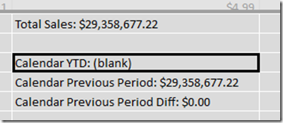
This is…AWESOME! However, when I go to drag on my time intelligence and performance measures, it doesn’t quite look right:

image

Whoa! That’s… not awesome. So let’s fix it. Back on the fact table, we can utilize a function called SWITCH, which works like a case statement in SQL. The syntax for switch starts with the column or value you want to evaluate, and then the cases afterwards, separated by commas. As an example, in this case, we want to swap in a different measure based on that [Date Calculation Selected] measure we created 2 paragraphs ago:

Active Measure:=SWITCH([Date Calculation Selected],1,[Total Sales],2,[Calendar YTD],3,[Calendar Previous Period],4,[Calendar Previous Period Diff])

We’re evaluating the [Date Calculation Selected], and then returning a different measure based on what the active context is for that row. Let’s go back to our pivot table, take off all of those old values and replace that didn’t look so good above and replace them with our new “Active Measure” measure:

image

Oh. My. God. That is so AWESOME!!!! Even more amazing, we could even take our date calculation table and put it in a slicer above, freeing the columns section of the pivot for something else to make this even more flexible and put in on a dashboard. This way, we can actually have the MEASURES in a slicer!

image

That is some serious awesome-sauce! The complete workbook is available for download here.
DAX: Calculating different rates on user defined inputs

A few weeks ago a client asked me an interesting question. They had a table of data, and they wanted to pass in (in their words) a variable in order to change the calculated value. I’d played around with banding before (see my post here), but I hadn’t been able to play with something quite as specific as the scenario they presented. To outline the issue, let’s say we have a user created table that consists of the different pricing tiers for our customers, similar to the below:

image


And we have a table of data that looks like this:

image

The challenge that the user wanted to present was to leave these 2 tables independent of each other. One challenge in DAX is that we cannot use a between statement to join tables, so we’re going to need to come up with something to give the value of the parameter we’re looking for. In the next step, I’ve now brought these 2 tables into Power Pivot, and joined in a date dimension, as shown by the below screenshot:


image

We can see that the data itself joins over to the date dimension fine, but we can’t join to the rates table as we are trying to go between. What we can do, however, is modify the data table to return the value of the parameter table, in a denormalized pattern. By utilizing the calculate command with a filter, we can get a list of that value repeated through our entire fact table.


=CALCULATE(VALUES(Rates[Value]),FILTER(Rates,Rates[Parameter]=”Hour Limit”))

In the above formula, I’m asking DAX to go to the rates table, and return back the corresponding value for the specific Hour Limit parameter. I can then repeat this same step to return the corresponding rate for each of the different tiers. Expanding on this value slightly, I can then do the same thing to return the tier 1 and tier 2 rate, to return the following values:

image


Now we can create a calculation to calculate the total amount that should be paid by the customer. For utility billing, it’s very common to have tiering rates, so for example, the first 2000 kWh hours are charged at one rate, but once you go over that, it’s then an additional surcharge on top of the tier 1 rate. We can come up with the amount due by using a formula like the below:

=IF([HoursUsed]<[SpecifiedLimit],([HoursUsed]*[Tier 1 Rate]),((([HoursUsed]-[SpecifiedLimit])*[Tier 2 Rate]) + ([SpecifiedLimit]*[Tier 1 Rate])))

Which gives me the following screenshot.

image


I can now either choose to leave it this way and hide my additional fields that are just doing the calculations, or roll them all into one. Rolling everything into one calculation so I only use one calculation in my model would result in a formula equal to the below:


=IF([HoursUsed]<(CALCULATE(VALUES(Rates[Value]),FILTER(Rates,Rates[Parameter]=”Hour Limit”))),
([HoursUsed]*(CALCULATE(VALUES(Rates[Value]),FILTER(Rates,Rates[Parameter]=”Tier 1 Rate”)))),
((([HoursUsed]-(CALCULATE(VALUES(Rates[Value]),FILTER(Rates,Rates[Parameter]=”Hour Limit”))))*(CALCULATE(VALUES(Rates[Value]),FILTER(Rates,Rates[Parameter]=”Tier 2 Rate”)))) +
((CALCULATE(VALUES(Rates[Value]),FILTER(Rates,Rates[Parameter]=”Hour Limit”)))* (CALCULATE(VALUES(Rates[Value]),FILTER(Rates,Rates[Parameter]=”Tier 1 Rate”))))))


A very handy way to get around the parameter issue in DAX is to use an excel workbook and link the Power Pivot or Tabular model to that in order to allow users to change “run-time” values, although it does require the Power Pivot model to be refreshed. This workbook can be downloaded here.

SSAS Tabular: Internal Physical Files

SSAS Tabular stores data mostly in memory. However, it still consists of two main engines to drive and respond to user queries, the formula engine and the storage engine. This, theoretically, is very similar to how queries were answered in multidimensional models. The overall query request follows a pattern that can be visually represented using the below diagram:


image


Just like in multidimensional, the formula engine takes the request, determines the optimal query plan, and then answers the query or requests the data that it needs from the storage engine. The storage engine runs against the data that the xVelocity engine stores in the cache. However, to me, 1 major question has bugged me about this from the beginning. In the case of a restart, or memory clearing of some way, how does the tabular model store it’s relationships between everything. The data itself may be stored in memory, but the relationships and the structure surely must have some reference files on disk that xVelocity and Tabular can use. Today while working and playing with it tonight, I think I’ve figured it out.


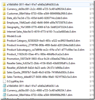
Each tabular model creates a folder in the data drive that we created and configured during installation, typically located at $InstallLocation/Microsoft SQL Server\MSAS11.TABULAR\OLAP\Data. Inside of this folder, each tabular model creates a folder, appended with .db, and an XML file. The XML file contains relevant information about the database, and the folder contains all the “good stuff”. Opening the folder against the Adventure Works tabular database, for example, gives me an image that looks like the below:

image


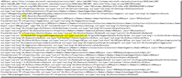
Similar to the database level, each table in tabular consists of an XML file, ended with .dim. Each table then also contains a folder. The .dim XML file contains relevant information about everything the table needs and the pointers that exist between the different columns to store the relationships for storage. Inside of the folder, each column consists of a tbl xml file, an IDF file, and potentially an HIDX file or DICTIONARY file, depending on the data type. Everything except for the tbl xml file are for tabular internal use, but we can get some good information about what tabular did during processing for each attribute from the tbl file. Opening up the tbl file, shows us some really good information about that column. We can see things like the min and max data id, and the number of segments:


image

Min and max segment and data id’s are things that the storage engine uses during query time to identify what data exists in the proper segment and data file. This is quite useful information! I’ll have to remember this for the future and when it comes to performance tuning tabular models.

SSAS Tabular: Transactional Deployment

SSAS has long performed deployment and processing as two very separate occurrences, that happen independently of each other. However, in tabular databases, there is a property that allows you to override this default behavior and tell SSAS to treat them as one process together. For developers, this is great news, as we can now tell SSAS to roll back the deployment if processing fails. The default behavior, with transactional deployment set to false, is that deployment can succeed before a process. What this means is that if you deploy a project successfully, but the processing then fails, you are left with an SSAS project that is unable to be browsed by any users until you can re-successfully process again.


To turn on this feature, right click on the project, and change the Transactional Deployment property from false to true. This option exists in both multidimensional and tabular solutions.


image


Awesome-sauce!

SSAS Tabular: Calculating the actual compression rate

We always hear about the power and compression ratio of tabular databases and Power Pivot, and how the Vertipaq compression engine can compress things up to 90% of what their source is. But, this opens up a lot of questions. For example, how can we properly size our tabular hardware solution in the first place? As in, how do we ensure that our hardware we’re setting aside is the proper amount. Unfortunately, just saying “Give me all the memory you can”, isn’t going to make our virtualization/networking guys a) love us, or b) happy. There are generally two steps in the iterative process for sizing:

Step 1: The initial estimate

Step 2: Refining the estimate and comparing the actual


Step 1 is relatively straight-forward. The general size of of a tabular database can be computed by running a simple calculation against the source database. First, run sp_spaceused against the database that you plan on bringing into your tabular model. If you are bringing in only a few tables, include the table name parameter in spaceused and calculate the total of all of the tables you wish to bring in. For this example, I have a simple AirlinePerformance data mart I’ve created on my local machine. Running sp_spaceused against the whole database gives me the following:

image

The generally accepted calculation we can run looks like the below:

([Database Size]/10) * 2

Dividing by 10 was established after benchmarking this formula against a wide range of datasets. You multiply it by 2 to account for when the database is not at rest, covering queries and processing operations. There are other formulas that exist that can go into deeper detail, but the generally accepted formula is the one above. Running this against my sample database gives me the following calculation:

(3182.75/10) * 2 = 636.55 mb

So the result of the above gives me 636 mb, which equates to 0.62 GB. I now know that I need to have at least 0.62 GB of RAM available to even load the model. This is the initial estimate, but how can I find the actual after I’ve created this. I’ve estimated 0.62, but is it accurate?

In step 2, we want to take our database after we’ve built the model and determine how much space it really is actually using. To get the actual file size of our tabular database, let’s go directly to the file system and determine it. Navigate to your SQL install directory ($\Microsoft SQL Server\MSAS11.TABULAR\OLAP\Data) and find the folder with the database name you’re calculating. Right click –> Properties, and get the file size of the folder. My file looks like the below:


image


So it’s 332 MB on disk. Let’s take 332 MB and divide it by our original uncompressed db size we got in our first statement (3182.75 MB). Divide the folder size into the original. 3182.75/332 = 9.58. NOW we have a good number for the actual compression ratio the Vertipaq engine is able to achieve. Remember, our original formula is ([Database Size]/10) * 2. We’re going to replace the 10 with our new actual compression rate, so the formula on my database would be like the below:

(3182.75/9.58) * 2 = 664.46 MB

So to handle a 3 GB source database, I need 664 MB of memory to handle it on an actual production server. As it is very hard to predict one blanket answer for everyone due to varying granularity, industires, data models, and data types, hopefully this will help other developers come up with decent size recommendations for your networking guys when you’re trying to get an idea of how much memory you need for your tabular database.

Power Pivot: Adding tooltips to your Power View report

In Excel 2013, did you know that you can make descriptions available to users as they’re browsing the model in Power View? I recently discovered this, and thought it was a really nice feature that you can use to add some extensibility to your Power View reports. In this blog post, I’d like to walk through and show how easy it is to get this set up for use in your environment.


Let’s start with a blank Excel workbook, and open up the Power Pivot window:


image


Let’s import some data into Power Pivot. For this example, I’m just going to import in the Internet Sales table from Adventure Works:


image


Now that it is loaded, find the UnitPrice column and right click on it. Look for the Description field.

image


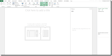
Select it, and the Description dialog window will appear. Type in “The price per unit that was charged.” and click OK. That’s it! Now let’s see it in action. Switch back over to excel view, and insert a Power View sheet.


image


Expand the Internet Sales table, and hover over the Unit Price column that you added the description to.


image


Your description now shows as a tooltip for report users to navigate and get additional information around. What’s even better, is this works exactly the same way in a tabular database when you’re building it. To demonstrate, open up the Adventure Works tabular database in 2012, and find the Internet Sales table again. Find the Unit Price column, right click and go to description.


image


In description, type in “The price per unit that was charged.” and click OK. Then build and deploy your solution. After it finishes deploying, open up Excel and connect to your tabular database.


image


After you click Finish, select Power View report under the Import Data dialog box and click Ok.


image


After your Power View sheet, open up the table list and find the Unit Price column again. Notice that your description can be implemented as a tooltip this way too.


image


That’s all for now! Short blog post, but very useful!

Dynamic Security in Tabular database

Tabular databases, like multidimensional, have the ability to create roles for additional security against our databases for individual business users. What’s more, it’s even easier to set up. Like other things in tabular, gone are the 9 or 10 different tabs, basic/advanced toggling etc. Roles in tabular and DAX use two functions to establish and manage security: the USERNAME DAX function and the LOOKUPVALUE DAX function. Lookupvalue is quickly becoming one of my favorite DAX functions, but that’s a different story. 🙂 Something important to consider when

First we’re going to go into our database and add a table that we can use to map to what we’re securing by. For this example, I’m going to map between the employee dimension and the sales territory dimension. To keep it simple, though, I’m going to list out the employee names, rather than having a EmployeeKey/Sales Territory key bridge table. Start by creating a table called Dynamic Security with the employeekey, names, and userlogon fields. My script is below:

CREATE TABLE dbo.UserSecurity
    ([EmployeeKey] [int] IDENTITY(1,1) NOT NULL,
    [SalesTerritoryKey] [int] NOT NULL,
    [FirstName] [varchar](50) NULL,
    [LastName] [varchar](50) NULL,
    [UserName] [varchar](50) NULL,
    )
GO


Then let’s input some values into it.

INSERT INTO [dbo].[UserSecurity]
VALUES    (1, ‘Administrator’,”,’DATA0\administrator’)
INSERT INTO [dbo].[UserSecurity]
VALUES    (2, ‘Administrator’,”,’DATA0\administrator’)
INSERT INTO [dbo].[UserSecurity]
VALUES    (3, ‘Bob’,’Williams’,’DATA0\bob’)
INSERT INTO [dbo].[UserSecurity]
VALUES    (4, ‘Steve’,’Smith’,’DATA0\steve’)


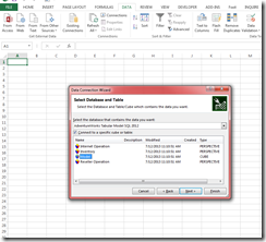
Now that we have our table created, we can do the actual security implementation. Open up the tabular database that you wish to apply the security too, and import your table. We’ll select and open our existing connection:

image


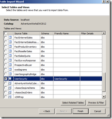
Then select the user security table that we created in Management studio and click Finish.

image


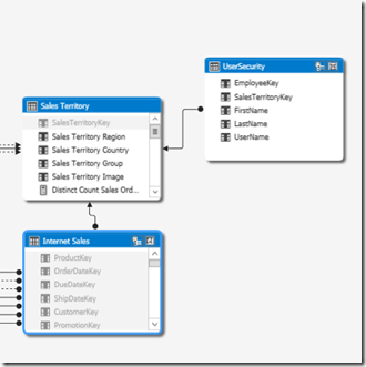
Once it’s imported, we then want to join it to the appropriate tables so we can relate to our security table. For this example we’re just joining to the Sales Territory. A snapshot of this piece of the model looks like:

image


Right click on the User Security table and click “Hide from Client Tools”. Now we can create our role. Scroll up to the top and click on Roles: (screenshot below if you need it)

image


Create a New Role, and give it a name. In this case, I’m calling it “Sales Territory Users”, giving read access under the permissions. Once you’ve done that, click on the Members tab, and add the users we have in our table. Below is a screenshot of what mine looks like with the 3 members I have in my table:


image

Go back to the Row Filters tab, and find the User Security table listed. Under the DAX Filter column, type in the following:

= FALSE()

Now find the Sales Territory table, and type in the following formula:

=’Sales Territory'[SalesTerritoryKey]=LOOKUPVALUE(UserSecurity[SalesTerritoryKey], ‘UserSecurity'[UserName], USERNAME(), UserSecurity[SalesTerritoryKey], ‘Sales Territory'[SalesTerritoryKey])

What this formula does is to say, “for each value in the UserSecurity[SalesTerritoryKey] column, find the current logged in Windows user name, and match it to the UserSecurity[SalesTerritoryKey] column. And only show rows where they match”


My Row FIlters section looks like the following:


image


Click Ok, and it will validate and finish your changes. Then go up to “Analyze in Excel”. Select “Other Windows user” and pick one of the users you have in your list. For this example, I picked Bob:


image


Click Ok, and then drag over your sales territory in the pivot table that appears. Drag over a measure so you get some data, and WHAMMY! some dynamic security awesome-ness:


image

Tabular Hierarchies Across Multiple Tables

Recently I was looking at the Adventure Works database and I noticed how Product, ProductCategory, and ProductSubCategory are their own separate tables. It got me to thinking about how someone might want to take attributes from each of those tables and create one hierarchy for reporting when you are looking at it. In DAX, this can be accomplished by using the RELATED() function. By using the related function in our table with our lowest level attributes, we can bring in the higher levels and create our hierarchy. This is really useful, especially if our data source isn’t necessarily a data warehouse and may be something more transactional with many tables split all over the place.


The Related function excepts one argument, which is the name of the table/column that we want to pull back. Let’s start with a simple diagram of our 3 tables:


image


Since our Product dimension is our lowest level of granularity of these attributes, what we want to do is bring the Product SubCategory and Product Category fields into the product dimension. Change your view to the data view in the product dimension and add a calculated column to pull in the subcategory:

=RELATED(DimProductSubcategory[EnglishProductSubcategoryName])

You can see our RELATED function at work. What we’re telling the function to do is to find the relationship that exists between product and product subcategory, and bring back the product sub category name. Once you click enter, rename the column to sub category name. Next we want to bring in the product category. Add a new calculated column, only this time our RELATED function is going to point 1 column farther, into the Product Category table. The RELATED function is really useful for this kind of analysis, especially since it can traverse multiple tables. For any old school excel pros out there, take that vlookup! Below is our new column with both Product Sub Category and Product Category added:

image


Hide your key column attribute, and then go to diagram view and hide your subcategory and category tables. To hide the entire table, right click on the table itself and select hide from client tools. Create a new hierarchy in your dimension where you added your related columns to, and added the category and subcategory to them. The final design looks like the below:


image


And that’s it! Now we have all of our related attributes in one table that we can create hierarchies off of. This is very useful for multiple snowflakes in a warehouse or transactional databases.

Discretization Buckets in Tabular

A little while ago I blogged about how to created discretization buckets in a multi-dimensional cube. The nice thing about it is that it was just a few properties that you needed to modify, and was pretty straightforward. To the flip side of that I see a lot of companies wanting to take advantage of the new tabular Analysis Services model and the performance you get from it. The good news is that you can do the same thing in tabular, but they’re not properties you set. To set it up, first you’ll need to identify what is going to create your buckets. Are you going to use a linked table? SQL view? Or maybe just a hard coded SQL Select statement. For this example, I’m going to assume that the business user wants the ability to change them easily, so I’m going to use a linked table. I’m also using the Adventure Works 2012 tabular demo project. One way to approach this dilemma is that you could just create an if statement in the table that groups your items for you, but what if a business user wants to change the values dynamically? Re-writing your calculation every time would be difficult, and frustrating to the end user. They want the ability to modify it as business needs change.


First, create your table in excel. When you’re done, save it and give a name. It should look something like:


image


You can see from the picture, nothing fancy. Just a quick table, took me longer to write this sentence than create it. 🙂


Then go into SSDT, and in your project select “Import from Data Source.” If you created a view in your source or are pulling your table from another source, this is where you would configure it. Assuming you’re using the Excel table, select Excel File from under the text files options:


image 


Click Next, and navigate to the file path from your earlier. Make sure to give your imported table a friendly name, as it will just name “Excel” by default:


image 


Click Next, and then click Finish. It should import your table in a few seconds. After you’ve imported it, and you view the model in diagram view, it should not be related to anything. This is OK, as there isn’t anything to join it to, as there are no columns in any of the tables that would join to it. The calculation we’re going to write here in a minute is going to give us what we’re looking for. 🙂


image


In order to solve this and give us our proper values, we’re going to take the values from the banding table and bring it directly into our Fact Internet Sale table.  Going to the Internet Sales table, we’re going to create a calculated column (the filter context) with the following formula:

=CALCULATE(VALUES(‘Banding Matrix'[Band]),’Banding Matrix'[High Value] >= EARLIER(‘Internet Sales'[Unit Price]),’Banding Matrix'[Low Value] < EARLIER(‘Internet Sales'[Unit Price]))

What this calculation is doing is taking the value (the name) of the pricing band that we’ve specified where the value of the unit price column is between the low and the high amounts we’ve specified. But this formula has 1 problem. Since our key business requirement here was that users can input the band values themselves, what if one the values in our fact table is missed? What we really need to do is format this in a way where we can protect the formula against an error. Using the IFERROR() function can help us here. So a better formula is:


=CALCULATE(IFERROR(VALUES(‘Banding Matrix'[Band]), "No Band Found"),’Banding Matrix'[High Value] >= EARLIER(‘Internet Sales'[Unit Price]),’Banding Matrix'[Low Value] < EARLIER(‘Internet Sales'[Unit Price]))

Now we are well protected and business users are happy. 🙂 Before you finish, click on the Banding configuration table tab and select “Hide from client tools”. Preview the model in Excel, pick any measure that you want out of the fact table, and select your new price banding matrix. The view below is showing me total sales amount by unit price group (band).


image


Now if a user wants to change the values for their groupings or just wants to know what they are, they have the control. There is no dependency on you or anyone else in IT to change it for them. Viva La Self Service BI Revolution!

Tabular Databases: The workspace server was not found

Sometimes, due to environment changes or some other reason, you want to change the workspace database that you are developing your tabular model against. I recently had a need to do this as my old tabular database instance was no longer active. When I went to open up the bim file, I received the following error message:


image


To fix it, click on the bim file once to select it and then go to properties (F4). The last property on the page is called “Workspace Server” and specifies where the workspace database server is. Change this field to the name of your new server and then the following confirmation screen will appear:


image


Simply click “Apply Change” and you’re done. Short and simple.