Power Pivot: Managing Refresh

Power Pivot workbooks need to be refreshed on a schedule. One of the coolest things about Power Pivot is that all that time that users had to spend gathering and scraping data from here, there, and everywhere is how seamless Power Pivot makes it. So why do all of that work to gather all that data to have it be static in your model. I don’t know anyone that wakes up every day thinking they just can’t wait to get into the office to click that magic refresh button. Fortunately, once you’ve loaded your Power Pivot workbook into your SharePoint Power Pivot gallery it’s easy to manage the day to day refresh schedule.


Start by opening up your Power Pivot workbook. You should see a little calendar icon at the top right of the viewing area:

image


If you click on it, it will open up a data refresh management screen:


image

First, check the Enable  box. This will turn the refresh capabilities on for that workbook.

Then select how often you want the workbook refreshed. Daily, Weekly, Monthly, or once. (Personally, I’m not sure of the once option?) We’ll set this workbook to refresh every day. Leave it as Daily,  and then we’ll change the right side to every weekday.

earliest start time tells the workbook when to refresh. If you select After Business Hours, SharePoint will use the business hours set by your admin and determine when to refresh based on availability. To me, this is like telling SSIS “yeah, just anytime you see fit between 9 PM and 6 AM, go for it. You kids have fun!” Uhh…no. Let’s change it to a specific earliest start time, and set a time of day.

email notifications tells the workbook who it should email if the unthinkable happens and it fails the refresh process. I usually put my email address in here, you might yours, the users, or your boss’. (I’d caution STRONGLY against that last one :))

credentials  allows you to set what user you want to run the refresh process. You might set it refresh off of your credentials, a specific account already created in the Secure Store Service, or the account the SharePoint admin configured for this refresh process already.

image


Data sources lets you select what Data sources you want to refresh. If you have a Power Pivot workbook pointing to multiple locations, you might choose to refresh one at this time of day and the other at a different time of the day (on another refresh schedule).

image

Side note: Please forgive the fact that my blacked out server name looks like my 2 year old did it, I’m using the trackpad on my laptop while sitting in the airport to do it


Once you’re all set and you’re happy with your settings, click OK. You’ll be returned back to the Power Pivot gallery with a workbook scheduled for some refreshed awesome-sauce!

DAX: Always get the Latest date for a slicer

You’ve done it. After some development, your Power Pivot model has some awesome-sauce, has a slicer for the day/month/year, and is ready to do some serious data insight. You set your slicer to the current moment in time, deploy it to a Power Pivot gallery in SharePoint, and start using your model. But then…tomorrow happens. And now your slicer is out of date. Every time a new day happens, the slicer gets farther and farther away. Your users don’t want to click the latest date every time they want to use the model, you’d like to make it dynamic so that you don’t have to click on the latest day every time. Rob Collie does an excellent introduction into this topic in his new book, and gives a good background on using a latest date slicer. I was recently reviewing this concept with a class when they went through all the different scenarios that this might apply in. (You know who you are! :)) I thought this would be a good opportunity for a blog post, to show the different levels and ways that this concept could be applied:


DATE TABLES THAT GO INTO THE FUTURE, FACT TABLES THAT GO UP TO TODAY

The first scenario we might run into is that our fact table has dates of that go up to today’s date, but our date dimension pulls dates that go into the future. Facts like this usually surround performance or actually happened metrics. Consider a date dimension that goes out 10 years into the future. Do we really need to pull the maximum date of the date dimension? No, as our slicer will be unusable until that end date happens, 10 years away! A neat trick to get around this is to pull the maximum date from the fact table, thereby only pulling the most recent date from our fact. We create a calculated column in our date table, with the below syntax:

=IF(MAX(‘Internet Sales'[OrderDateKey])=[DateKey],”Latest”,FORMAT([FullDateAlternateKey],”mm-dd-yyyy”))

This gives us a slicer that looks like the below, and allows us to select “Latest” as our default value, ensuring that we always have the most recent data selected in our visualizations:

image

Now this is awesome, but I don’t know if I’d call it awesome sauce. Let’s try and modify our date slicer a little:


CREATING A SLICER AT THE MONTH LEVEL

Slicers are really built to be views of our data, right? Because of this, slicers should generally contain pieces of data that have less distinct values than other pieces of our model. I can modify my query above to pull the current month of data, thereby limiting my my “Latest” value slicer to only months, making it easier and less overwhelming for a user:


=IF(LEFT(MAX(‘Internet Sales'[OrderDateKey]),6)=LEFT([DateKey],6),”Latest”,[CalendarYear]&”-“&[EnglishMonthName])


I’ve highlighted my changes in red. I want to make sure I preserve the integer portion of the keys, in order to keep performance up. I’ve taken the 6 left of the max of the fact table, and joined it to all of the days that fall in the month in my date table. This way, my slicer will return all of the facts that happened in that month.


Resulting in the following slicer on screen:


image


One really quick modification I could make to this is to change number 6 in the number of characters argument of the LEFT function to 4, to return only the year. Change the last portion of the IF statement to return all of the days that fall in the current year, and I could get a “Latest” Year slicer.


Awesome Sauce! I could end this post here, but I wanted to present two other scenarios you might run into.


MAP THE LAST UPDATE FIELD IN YOUR MODEL TO THE LAST DATE OF THE SLICER

Another technique Rob has detailed over at powerpivotpro is how to use a “LastUpdated” date in your model to show the date/time you data is current as of. By changing a quick part of the statement, we can utilize that field as our “Latest” date:

=IF(INT(FORMAT(MAX(LastUpdatedDateTime[LastUpdatedDateTime]),”YYYYMMDD”))=[DateKey],”Latest”,FORMAT([FullDateAlternateKey],”mm-dd-yyyy”))

Again, I’ve highlighted my changes in red. This time, we’re pulling the LastUpdatedDateTime into our model as a datetime. In order to compare it to what our datekey is, we need to convert our date returned into a value that matches the format of our date key, which is why we have the format function included. By default, format returns the result back as text, so we wrap the whole function in an INT function to convert the result of our format as an integer.


DATE TABLES THAT GO INTO THE FUTURE, FACT TABLES THAT GO INTO THE FUTURE

Another common modeling issue we might see when we want to implement something like this is when BOTH the date table and the fact table go into the future, as we might commonly see in budgeting, project planning, and construction. Pulling the max date from our date table is going to give us date really far in the future, as will the fact table! A common joke I tell my students during class is “Do as I mean, not as I say”. We need to tell DAX the same thing. DAX has a built in function to return today’s date, called TODAY(). By changing the other side of our IF condition test, we can tell DAX that the record we want to tag with the “Latest” annotation is today:

=IF([DateKey]=INT(FORMAT(TODAY(),”YYYYMMDD”)),”Latest”,FORMAT([FullDateAlternateKey],”mm-dd-yyyy”))

All we did there was move our INT(FORMAT( function from the left side of the equation to the right! This breaks my earlier statement of having a lot of slicers at the day level, though, so I want to create one more to return the current month and year as my slicer value:

=IF(INT(LEFT([DateKey],6))=INT(FORMAT(TODAY(),”YYYYMM”)),”Latest”,[CalendarYear]&”-“&[EnglishMonthName])


The workbook is available for download here. (no size issues this time, I checked. :))

DAX: Date Calculation Tables

Some time ago, I blogged about using a date calculation dimension in a multidimensional cube, and how easy it makes doing time intelligence in a multidimensional model. 2014 seems to have started out as “the year of Power Pivot”, as it is definitely gaining traction with my clients and more and more of them are asking about it during engagements. One of the absolutely amazing things I get absolutely giddy about in Power Pivot is the concept of disconnected slicers. As Rob Collie best said, disconnected slicers in Power Pivot are pure magic. I particularly enjoy the “mad scientist” reference he makes. For those unfamiliar, a disconnected slicer is a piece of data that has absolutely nothing to relate to in your data, but you want to use it as a part of your analysis. For a great introduction, see Rob’s Power Pivot pro blog about it as an introduction. I was recently showing a client this mad scientist level stuff, but then took the natural progression and thought: “If I can do this to control the number of months back, can I take it a step further and create a date calculation dimension like in multidimensional too?” What, that wasn’t the first thing you thought too?

First off, let’s create some measures in Power Pivot that contain our measures and time intelligence analysis:

image

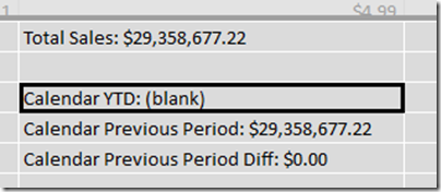
For this post, I’ve created 4: Total Sales, Calendar YTD Sales, Previous Period, and previous period diff. These are typical time intelligence functions, nothing overly special or different that I did on them. If you’re interested, these are the formulas for them:

Total Sales:=SUM([SalesAmount])

Calendar YTD:=TOTALYTD([Total Sales],’Date'[FullDateAlternateKey])

Calendar Previous Period:=CALCULATE([Total Sales],DATEADD(‘Date'[FullDateAlternateKey],-12,MONTH))

Calendar Previous Period Diff:=[Total Sales]-[Calendar Previous Period]

Not too bad, yet. Ok, let’s create a table to house our disconnected slicer. In Excel, create a table with the value you want to select and an “ID” column next to it:

image

Then, add it in to your data model, either by copying and pasting or clicking the “Add to Data Model” link in the Power Pivot ribbon. Below is my Power Pivot diagram view after importing, notice how there is no relationship between the date calculation table and the fact table:

image

Getting back in to the data view, we’ll navigate back to the fact table, and take the same approach as Rob did for his disconnected slicer to return the currently selected slicer:

Date Calculation Selected:=MIN(‘Date Calculation'[Value])

In the preceding formula, we’re taking the min value of the value column of the date calculation dimension. This allows us to then select the current active context inside of our pivot table. In the below image, I’m selecting the measure value from disconnected slicer table I created, and the Date Calculation selected measure from my fact table.

image

This is…AWESOME! However, when I go to drag on my time intelligence and performance measures, it doesn’t quite look right:

image

Whoa! That’s… not awesome. So let’s fix it. Back on the fact table, we can utilize a function called SWITCH, which works like a case statement in SQL. The syntax for switch starts with the column or value you want to evaluate, and then the cases afterwards, separated by commas. As an example, in this case, we want to swap in a different measure based on that [Date Calculation Selected] measure we created 2 paragraphs ago:

Active Measure:=SWITCH([Date Calculation Selected],1,[Total Sales],2,[Calendar YTD],3,[Calendar Previous Period],4,[Calendar Previous Period Diff])

We’re evaluating the [Date Calculation Selected], and then returning a different measure based on what the active context is for that row. Let’s go back to our pivot table, take off all of those old values and replace that didn’t look so good above and replace them with our new “Active Measure” measure:

image

Oh. My. God. That is so AWESOME!!!! Even more amazing, we could even take our date calculation table and put it in a slicer above, freeing the columns section of the pivot for something else to make this even more flexible and put in on a dashboard. This way, we can actually have the MEASURES in a slicer!

image

That is some serious awesome-sauce! The complete workbook is available for download here.

DAX: Calculating different rates on user defined inputs

A few weeks ago a client asked me an interesting question. They had a table of data, and they wanted to pass in (in their words) a variable in order to change the calculated value. I’d played around with banding before (see my post here), but I hadn’t been able to play with something quite as specific as the scenario they presented. To outline the issue, let’s say we have a user created table that consists of the different pricing tiers for our customers, similar to the below:

image


And we have a table of data that looks like this:

image

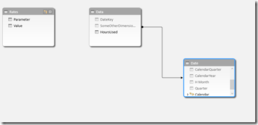
The challenge that the user wanted to present was to leave these 2 tables independent of each other. One challenge in DAX is that we cannot use a between statement to join tables, so we’re going to need to come up with something to give the value of the parameter we’re looking for. In the next step, I’ve now brought these 2 tables into Power Pivot, and joined in a date dimension, as shown by the below screenshot:


image

We can see that the data itself joins over to the date dimension fine, but we can’t join to the rates table as we are trying to go between. What we can do, however, is modify the data table to return the value of the parameter table, in a denormalized pattern. By utilizing the calculate command with a filter, we can get a list of that value repeated through our entire fact table.


=CALCULATE(VALUES(Rates[Value]),FILTER(Rates,Rates[Parameter]=”Hour Limit”))

In the above formula, I’m asking DAX to go to the rates table, and return back the corresponding value for the specific Hour Limit parameter. I can then repeat this same step to return the corresponding rate for each of the different tiers. Expanding on this value slightly, I can then do the same thing to return the tier 1 and tier 2 rate, to return the following values:

image


Now we can create a calculation to calculate the total amount that should be paid by the customer. For utility billing, it’s very common to have tiering rates, so for example, the first 2000 kWh hours are charged at one rate, but once you go over that, it’s then an additional surcharge on top of the tier 1 rate. We can come up with the amount due by using a formula like the below:

=IF([HoursUsed]<[SpecifiedLimit],([HoursUsed]*[Tier 1 Rate]),((([HoursUsed]-[SpecifiedLimit])*[Tier 2 Rate]) + ([SpecifiedLimit]*[Tier 1 Rate])))

Which gives me the following screenshot.

image


I can now either choose to leave it this way and hide my additional fields that are just doing the calculations, or roll them all into one. Rolling everything into one calculation so I only use one calculation in my model would result in a formula equal to the below:


=IF([HoursUsed]<(CALCULATE(VALUES(Rates[Value]),FILTER(Rates,Rates[Parameter]=”Hour Limit”))),
([HoursUsed]*(CALCULATE(VALUES(Rates[Value]),FILTER(Rates,Rates[Parameter]=”Tier 1 Rate”)))),
((([HoursUsed]-(CALCULATE(VALUES(Rates[Value]),FILTER(Rates,Rates[Parameter]=”Hour Limit”))))*(CALCULATE(VALUES(Rates[Value]),FILTER(Rates,Rates[Parameter]=”Tier 2 Rate”)))) +
((CALCULATE(VALUES(Rates[Value]),FILTER(Rates,Rates[Parameter]=”Hour Limit”)))* (CALCULATE(VALUES(Rates[Value]),FILTER(Rates,Rates[Parameter]=”Tier 1 Rate”))))))


A very handy way to get around the parameter issue in DAX is to use an excel workbook and link the Power Pivot or Tabular model to that in order to allow users to change “run-time” values, although it does require the Power Pivot model to be refreshed. This workbook can be downloaded here.

Power Pivot: Adding tooltips to your Power View report

In Excel 2013, did you know that you can make descriptions available to users as they’re browsing the model in Power View? I recently discovered this, and thought it was a really nice feature that you can use to add some extensibility to your Power View reports. In this blog post, I’d like to walk through and show how easy it is to get this set up for use in your environment.


Let’s start with a blank Excel workbook, and open up the Power Pivot window:


image


Let’s import some data into Power Pivot. For this example, I’m just going to import in the Internet Sales table from Adventure Works:


image


Now that it is loaded, find the UnitPrice column and right click on it. Look for the Description field.

image


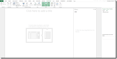
Select it, and the Description dialog window will appear. Type in “The price per unit that was charged.” and click OK. That’s it! Now let’s see it in action. Switch back over to excel view, and insert a Power View sheet.


image


Expand the Internet Sales table, and hover over the Unit Price column that you added the description to.


image


Your description now shows as a tooltip for report users to navigate and get additional information around. What’s even better, is this works exactly the same way in a tabular database when you’re building it. To demonstrate, open up the Adventure Works tabular database in 2012, and find the Internet Sales table again. Find the Unit Price column, right click and go to description.


image


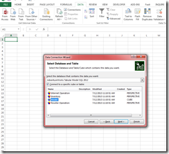
In description, type in “The price per unit that was charged.” and click OK. Then build and deploy your solution. After it finishes deploying, open up Excel and connect to your tabular database.


image


After you click Finish, select Power View report under the Import Data dialog box and click Ok.


image


After your Power View sheet, open up the table list and find the Unit Price column again. Notice that your description can be implemented as a tooltip this way too.


image


That’s all for now! Short blog post, but very useful!

Power Pivot Unable to find the requested .Net data provider

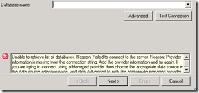
Recently I was trying to create a PowerPivot workbook at a client site and when I went to create a new PowerPivot workbook, I received this error:


image


Initially, I thought it was a permissions issue, and went and checked my access to the provider files located at $:\Program Files\Microsoft Analysis Services\AS OLEDB. When I saw that I had proper read access, I was puzzled for a few minutes as I couldn’t figure out how to get it corrected. I did a little bit of research and then came across this connect issue:

http://connect.microsoft.com/VisualStudio/feedback/details/652192/visual-studio-2010-add-connection-fails


Curiously, this server did happen to have IBM iSeries drivers installed, and I thought it worth checking out. I went to the machine.config file located at C:\Windows\Microsoft.NET\Framework64\v4.0.30319\Config, and edited the file in notepad. About halfway down the file I found my culprit:


image


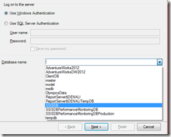
I deleted the <DbProviderFactories/> stub, saved the file, and then closed and reopened excel. I re-opened PowerPivot, typed in my server name, and then clicked the database dropdown:

image


Problem solved. I hope you don’t lose as much time on this as I did.

DAX UseRelationship Function

In DAX, a major design approach change has to do with role-playing dimensions. They don’t need to be built into your warehouse differently, but the way they are handled in creating formulas and browsing is much different. Using the date dimension (as it’s the most common role playing dimension) as an example, in Multidimensional role-playing dimensions are materialized during cube processing and the dimension is propagated out for each date in your fact table. Therefore, using OrderDate, ShipDate, and DueDate, when a multidimensional cube is processed, each of these dates become their own dimension within the cube. In tabular, no such physically materialized dimensions exist, and only 1 date dimension is created and is used. Logically, this makes sense if we think about how efficient tabular is at storing only distinct values with pointers to retrieve the current record set, but it is worth exploring what the trade offs are.


When a business user has a question about one of these dates, they are asking the same question, just the way we answer it is different. For example, take the below approach in multidimensional to answer the question of how many orders did I receive by day/month/year. We would simply take our materialized Order Date dimension, drag over our hierarchy, and expand it appropriately. The result would look like the below.

 image


The real question we’re asking here is “How many total orders did I have?” Date is merely an attribute of that fact, just as it in a table. Do we really need OrderDate as it’s own explicit dimension? Even more relevant, we’re limiting ourselves in this view in that we can only look at Orders by date right now, if we add number of shipments, for example, we’d be looking at number of shipments by order date, which doesn’t tell us what we’re really looking for. The calculation where we specify we want Orders is in our calculation, so we don’t need an explicit order date dimension.


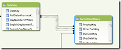
Creating the same thing in DAX is much simpler. Creating a PowerPivot workbook, and bringing in the FactInternetSales table along with the date dimension, we’ve created the relationship from the fact table for OrderDate, ShipDate, and DueDate to our DateKey in the date dimension. I’ve also specified that ShipDate is the active relationship. Our table relationship in the PowerPivot diagram view looks like this:

image


The questions we want to answer is “Number of Orders” and given the above limitation in multidimensional, “Number of Shipments.” In DAX, we can use the function CALCULATE combined with USERELATIONSHIP to explicitly specify what relationship we want DAX to use when performing that calculaton. Bringing up the FactInternetSales in data view, navigate to the calculations section of the table and under Orderdate you want to create a function using both CALCULATE and USERELATIONSHIP.


NumberOfOrders:=CALCULATE(COUNT(‘FactInternetSales'[OrderDate]),USERELATIONSHIP(‘FactInternetSales'[OrderDateKey],’DimDate'[DateKey]))


The Userelationship function is particularly handy, as we can tell DAX to not use the default relationship and to use the relationship we specify instead. It only accepts two arguments: the table we are specify the relationship from (‘FactInternetSales’[OrderDateKey]) and the table we are specifying the relationship to (‘DimDate’[DateKey]).


Now under the ShipDateKey column in the fact table we’re going to do the same thing, just specifying shipments instead of orders:


NumberOfShipments:=CALCULATE(COUNT(‘FactInternetSales'[ShipDateKey]),USERELATIONSHIP(‘FactInternetSales'[ShipDateKey],’DimDate'[DateKey]))

Now create a pivot table, drag over a date hierarchy (or just the year/month attributes if you haven’t built a calendar hierarchy), and then drag over your new measures. The result should look like:


image


Coincidentally, since we’re using AdventureWorks both NumberOfOrders and NumberOfShipments have the same final grand total, but you can see how the number of orders and number of shipments changed by date. And since we’re using just the straight dimension (not a materialized Order Date dimension) we can also rest easy knowing that the business is getting the correct values when they just drag over date. You also get the added benefit that business users only have 1 date that they can select, so you won’t get the “Why are there so many?” question.

Sorting Month Names in DAX

I was recently helping a client set up their PowerPivot workbook for the first time and when they brought the months over on the pivot table, the results of the month weren’t sorted, so for example, April and August were the first months the list. Typically, users want to see months in sequential order (January, February, etc.). As DAX doesn’t have a key order by field, it’s a little bit different than in SSAS, where you can just order by the different key field. The solution is to create a separate column which is a concatenation of your Month number and month name fields so PowerPivot will display it in order.


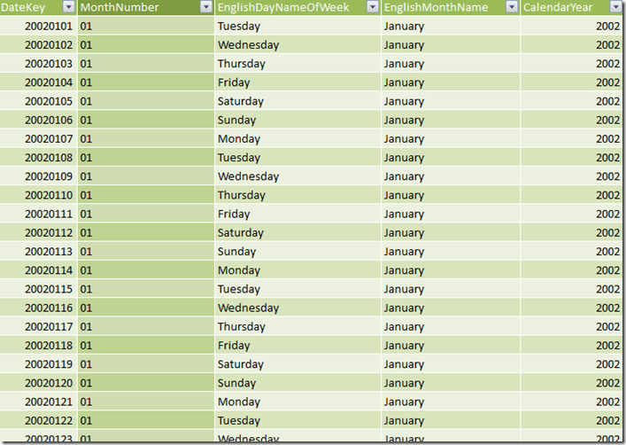
For example, in your date dimension you have  a column called Month Number and a column called Month name

image


When you drag it over in excel, it’s completely out of order:


April 90
August 124
December 93
February 85
January 93
July 124
June 90
March 93
May 93
November 120
October 93
September 90


To sort it, add a column to the end of your PowerPivot workbook in the row context:


image


In the column, type up your formula. Concatenate the month number and the month number with a formula. In between the quotations, you can set it to be whatever you, or your business users, would like to see.


=[MonthNumberOfYear]& “-“&[EnglishMonthName]


Your new column will look like:


image


Right click and click rename, give your column a name, and go back to Excel. Drag over your new column in your PivotTable, and Voila! Months ordered in PowerPivot.


01-January 93
02-February 85
03-March 93
04-April 90
05-May 93
06-June 90
07-July 124
08-August 124
09-September 90
10-October 93
11-November 120
12-December 93