Connecting SSAS Tabular to Excel Files in SharePoint

One of my absolute favorite features in tabular models is the ease in which we can do things like discretization and grouping. What used to take days in Multidimensional can now be accomplished in just minutes. Additionally, we can now give full control of these groups to business users to be able to dynamically adjust these groups in Excel, and import these into our tabular models. I did a post a while back about setting up discretization buckets in tabular, but I was recently showing this to a client and the thought occurred to me that we could create a SharePoint library to house these workbooks instead of having to keep them on a fileshare. Placing them into SharePoint allows us to set security, adjust it in the browser, and just get some other awesome sauce into our model. This should be a pretty short post, but it’s really cool so bear with me. 🙂


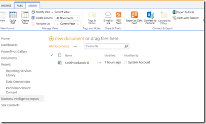
First, create a SharePoint library to house you’re workbook. Truthfully, any library will do but long term you’re going to want to restrict this library down to just a few individuals who can access it. Once your library is created, upload the workbook. Now select the workbook, and go up to Library in the browser options. About halfway across the top of the page, there is an option to “Open in Explorer”

image


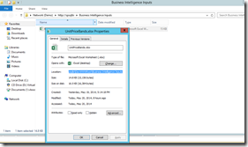
When you select that, your workbook will open up in windows explorer and you can then grab the connection string. Right click on the file, and go to properties. You want to grab the location section, and then add in the workbook at the end of it. Notice that SharePoint files have an extra section in the filepath that must be there in order for it to pull.

image

Copy it, and move over to tabular. In the tabular model, create a new connection to an excel workbook, and then paste the filepath you just copied in. Click through and you’re good to go. Now when users want to modify groups they can do so easily from within SharePoint, and you’re tabular model can just pull that data through. Awesome-sauce!

What happens when the OLAP Query Log doesn’t turn on

Bill Anton recently had a really great post about the OLAP query log and how to turn it on and translate it into English (available here). I’ve been meaning to blog about this for awhile but have been putting it off, and reading his post motivated me to go actually do it, instead of just staring at the note I have sketched down (thanks Bill!) One thing to keep in mind is that the query log does consume I/O while in use, so be careful about putting too much overhead on your server.


So let’s say you do all this great reading, and want to turn on your OLAP Query Log. You go to properties->general, and change the query log create table to true, specify your connection string, give your table a name, and then go check your database. But….nothing happens. Even after you refresh. Oh, Analysis Services, why must you vex me so? Fortunately, all of the information Analysis Services is doing with trying to create this table is logged. We just need to know where.


Deep in the depths of Analysis Services there is a file (well, lots of them actually, but we’re looking for something specific here :)). In the SQL Analysis services install directory, everything that the msmdsrv config file tries to do has a corresponding log entry, located in a log file at $InstallDrive\Microsoft SQL Server\MSAS12.MSSQLSERVER\OLAP\Log (note the 12 is the version number, for 2014. yours might be 11 for 2012, 10.5 for 2008R2, 10 for 2008, or 9 for 2005). In it is a simple text file called msmdsrv that shows all of the activity. It contains information like the start and stop times of the service, flight recorder start/stop info, some I/O information, and general configuration errors. If you scroll down to the bottom (assuming you just tried to create the OLAP Query log table and it doesn’t work, you should see an entry with the detailed error information:


image


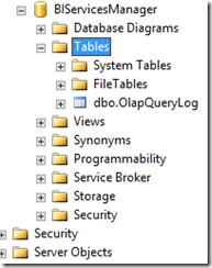
Starting at the bottom, it says “An error occurred while starting the query log. Now we know at least what happened! An error. Ok, what error? Up two lines is our culprit: “Login failed for user ______________”. There we have it. I’d changed the service account on my vm to a dedicated SSAS MD service account (best practice and all), and hadn’t given it login and create table permissions in the source server. I’m going to go create a user in the SQL database engine for my new service account, and then go back into the properties. Turn the create table to false, click Ok. Go back in and change back to true, and click Ok. Now Analysis Services was able to create the log table without any issues:


image


Fortunately, a relatively easy fix, once you find the log file. Now my mind is beginning to wonder what else we can do with this log file… (hmm. definitely unstructured. maybe either filestream to get it into SQL or…. A HADOOP CLUSTER!!!!)

DAX: Date Calculation Tables

Some time ago, I blogged about using a date calculation dimension in a multidimensional cube, and how easy it makes doing time intelligence in a multidimensional model. 2014 seems to have started out as “the year of Power Pivot”, as it is definitely gaining traction with my clients and more and more of them are asking about it during engagements. One of the absolutely amazing things I get absolutely giddy about in Power Pivot is the concept of disconnected slicers. As Rob Collie best said, disconnected slicers in Power Pivot are pure magic. I particularly enjoy the “mad scientist” reference he makes. For those unfamiliar, a disconnected slicer is a piece of data that has absolutely nothing to relate to in your data, but you want to use it as a part of your analysis. For a great introduction, see Rob’s Power Pivot pro blog about it as an introduction. I was recently showing a client this mad scientist level stuff, but then took the natural progression and thought: “If I can do this to control the number of months back, can I take it a step further and create a date calculation dimension like in multidimensional too?” What, that wasn’t the first thing you thought too?

First off, let’s create some measures in Power Pivot that contain our measures and time intelligence analysis:

image

For this post, I’ve created 4: Total Sales, Calendar YTD Sales, Previous Period, and previous period diff. These are typical time intelligence functions, nothing overly special or different that I did on them. If you’re interested, these are the formulas for them:

Total Sales:=SUM([SalesAmount])

Calendar YTD:=TOTALYTD([Total Sales],’Date'[FullDateAlternateKey])

Calendar Previous Period:=CALCULATE([Total Sales],DATEADD(‘Date'[FullDateAlternateKey],-12,MONTH))

Calendar Previous Period Diff:=[Total Sales]-[Calendar Previous Period]

Not too bad, yet. Ok, let’s create a table to house our disconnected slicer. In Excel, create a table with the value you want to select and an “ID” column next to it:

image

Then, add it in to your data model, either by copying and pasting or clicking the “Add to Data Model” link in the Power Pivot ribbon. Below is my Power Pivot diagram view after importing, notice how there is no relationship between the date calculation table and the fact table:

image

Getting back in to the data view, we’ll navigate back to the fact table, and take the same approach as Rob did for his disconnected slicer to return the currently selected slicer:

Date Calculation Selected:=MIN(‘Date Calculation'[Value])

In the preceding formula, we’re taking the min value of the value column of the date calculation dimension. This allows us to then select the current active context inside of our pivot table. In the below image, I’m selecting the measure value from disconnected slicer table I created, and the Date Calculation selected measure from my fact table.

image

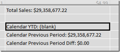
This is…AWESOME! However, when I go to drag on my time intelligence and performance measures, it doesn’t quite look right:

image

Whoa! That’s… not awesome. So let’s fix it. Back on the fact table, we can utilize a function called SWITCH, which works like a case statement in SQL. The syntax for switch starts with the column or value you want to evaluate, and then the cases afterwards, separated by commas. As an example, in this case, we want to swap in a different measure based on that [Date Calculation Selected] measure we created 2 paragraphs ago:

Active Measure:=SWITCH([Date Calculation Selected],1,[Total Sales],2,[Calendar YTD],3,[Calendar Previous Period],4,[Calendar Previous Period Diff])

We’re evaluating the [Date Calculation Selected], and then returning a different measure based on what the active context is for that row. Let’s go back to our pivot table, take off all of those old values and replace that didn’t look so good above and replace them with our new “Active Measure” measure:

image

Oh. My. God. That is so AWESOME!!!! Even more amazing, we could even take our date calculation table and put it in a slicer above, freeing the columns section of the pivot for something else to make this even more flexible and put in on a dashboard. This way, we can actually have the MEASURES in a slicer!

image

That is some serious awesome-sauce! The complete workbook is available for download here.

DAX: Calculating different rates on user defined inputs

A few weeks ago a client asked me an interesting question. They had a table of data, and they wanted to pass in (in their words) a variable in order to change the calculated value. I’d played around with banding before (see my post here), but I hadn’t been able to play with something quite as specific as the scenario they presented. To outline the issue, let’s say we have a user created table that consists of the different pricing tiers for our customers, similar to the below:

image


And we have a table of data that looks like this:

image

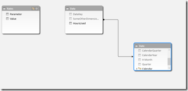
The challenge that the user wanted to present was to leave these 2 tables independent of each other. One challenge in DAX is that we cannot use a between statement to join tables, so we’re going to need to come up with something to give the value of the parameter we’re looking for. In the next step, I’ve now brought these 2 tables into Power Pivot, and joined in a date dimension, as shown by the below screenshot:


image

We can see that the data itself joins over to the date dimension fine, but we can’t join to the rates table as we are trying to go between. What we can do, however, is modify the data table to return the value of the parameter table, in a denormalized pattern. By utilizing the calculate command with a filter, we can get a list of that value repeated through our entire fact table.


=CALCULATE(VALUES(Rates[Value]),FILTER(Rates,Rates[Parameter]=”Hour Limit”))

In the above formula, I’m asking DAX to go to the rates table, and return back the corresponding value for the specific Hour Limit parameter. I can then repeat this same step to return the corresponding rate for each of the different tiers. Expanding on this value slightly, I can then do the same thing to return the tier 1 and tier 2 rate, to return the following values:

image


Now we can create a calculation to calculate the total amount that should be paid by the customer. For utility billing, it’s very common to have tiering rates, so for example, the first 2000 kWh hours are charged at one rate, but once you go over that, it’s then an additional surcharge on top of the tier 1 rate. We can come up with the amount due by using a formula like the below:

=IF([HoursUsed]<[SpecifiedLimit],([HoursUsed]*[Tier 1 Rate]),((([HoursUsed]-[SpecifiedLimit])*[Tier 2 Rate]) + ([SpecifiedLimit]*[Tier 1 Rate])))

Which gives me the following screenshot.

image


I can now either choose to leave it this way and hide my additional fields that are just doing the calculations, or roll them all into one. Rolling everything into one calculation so I only use one calculation in my model would result in a formula equal to the below:


=IF([HoursUsed]<(CALCULATE(VALUES(Rates[Value]),FILTER(Rates,Rates[Parameter]=”Hour Limit”))),
([HoursUsed]*(CALCULATE(VALUES(Rates[Value]),FILTER(Rates,Rates[Parameter]=”Tier 1 Rate”)))),
((([HoursUsed]-(CALCULATE(VALUES(Rates[Value]),FILTER(Rates,Rates[Parameter]=”Hour Limit”))))*(CALCULATE(VALUES(Rates[Value]),FILTER(Rates,Rates[Parameter]=”Tier 2 Rate”)))) +
((CALCULATE(VALUES(Rates[Value]),FILTER(Rates,Rates[Parameter]=”Hour Limit”)))* (CALCULATE(VALUES(Rates[Value]),FILTER(Rates,Rates[Parameter]=”Tier 1 Rate”))))))


A very handy way to get around the parameter issue in DAX is to use an excel workbook and link the Power Pivot or Tabular model to that in order to allow users to change “run-time” values, although it does require the Power Pivot model to be refreshed. This workbook can be downloaded here.

SSAS Tabular: Internal Physical Files

SSAS Tabular stores data mostly in memory. However, it still consists of two main engines to drive and respond to user queries, the formula engine and the storage engine. This, theoretically, is very similar to how queries were answered in multidimensional models. The overall query request follows a pattern that can be visually represented using the below diagram:


image


Just like in multidimensional, the formula engine takes the request, determines the optimal query plan, and then answers the query or requests the data that it needs from the storage engine. The storage engine runs against the data that the xVelocity engine stores in the cache. However, to me, 1 major question has bugged me about this from the beginning. In the case of a restart, or memory clearing of some way, how does the tabular model store it’s relationships between everything. The data itself may be stored in memory, but the relationships and the structure surely must have some reference files on disk that xVelocity and Tabular can use. Today while working and playing with it tonight, I think I’ve figured it out.


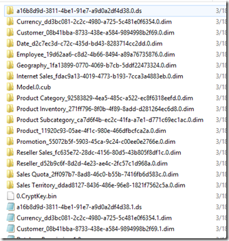
Each tabular model creates a folder in the data drive that we created and configured during installation, typically located at $InstallLocation/Microsoft SQL Server\MSAS11.TABULAR\OLAP\Data. Inside of this folder, each tabular model creates a folder, appended with .db, and an XML file. The XML file contains relevant information about the database, and the folder contains all the “good stuff”. Opening the folder against the Adventure Works tabular database, for example, gives me an image that looks like the below:

image


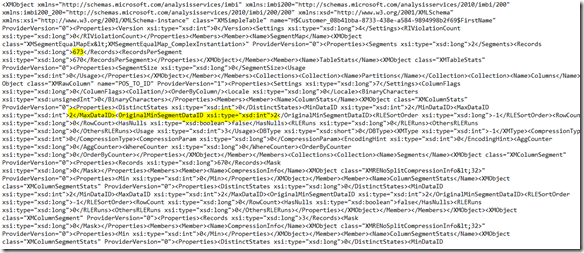
Similar to the database level, each table in tabular consists of an XML file, ended with .dim. Each table then also contains a folder. The .dim XML file contains relevant information about everything the table needs and the pointers that exist between the different columns to store the relationships for storage. Inside of the folder, each column consists of a tbl xml file, an IDF file, and potentially an HIDX file or DICTIONARY file, depending on the data type. Everything except for the tbl xml file are for tabular internal use, but we can get some good information about what tabular did during processing for each attribute from the tbl file. Opening up the tbl file, shows us some really good information about that column. We can see things like the min and max data id, and the number of segments:


image

Min and max segment and data id’s are things that the storage engine uses during query time to identify what data exists in the proper segment and data file. This is quite useful information! I’ll have to remember this for the future and when it comes to performance tuning tabular models.

SSAS Tabular: Transactional Deployment

SSAS has long performed deployment and processing as two very separate occurrences, that happen independently of each other. However, in tabular databases, there is a property that allows you to override this default behavior and tell SSAS to treat them as one process together. For developers, this is great news, as we can now tell SSAS to roll back the deployment if processing fails. The default behavior, with transactional deployment set to false, is that deployment can succeed before a process. What this means is that if you deploy a project successfully, but the processing then fails, you are left with an SSAS project that is unable to be browsed by any users until you can re-successfully process again.


To turn on this feature, right click on the project, and change the Transactional Deployment property from false to true. This option exists in both multidimensional and tabular solutions.


image


Awesome-sauce!

SSAS Tabular: Calculating the actual compression rate

We always hear about the power and compression ratio of tabular databases and Power Pivot, and how the Vertipaq compression engine can compress things up to 90% of what their source is. But, this opens up a lot of questions. For example, how can we properly size our tabular hardware solution in the first place? As in, how do we ensure that our hardware we’re setting aside is the proper amount. Unfortunately, just saying “Give me all the memory you can”, isn’t going to make our virtualization/networking guys a) love us, or b) happy. There are generally two steps in the iterative process for sizing:

Step 1: The initial estimate

Step 2: Refining the estimate and comparing the actual


Step 1 is relatively straight-forward. The general size of of a tabular database can be computed by running a simple calculation against the source database. First, run sp_spaceused against the database that you plan on bringing into your tabular model. If you are bringing in only a few tables, include the table name parameter in spaceused and calculate the total of all of the tables you wish to bring in. For this example, I have a simple AirlinePerformance data mart I’ve created on my local machine. Running sp_spaceused against the whole database gives me the following:

image

The generally accepted calculation we can run looks like the below:

([Database Size]/10) * 2

Dividing by 10 was established after benchmarking this formula against a wide range of datasets. You multiply it by 2 to account for when the database is not at rest, covering queries and processing operations. There are other formulas that exist that can go into deeper detail, but the generally accepted formula is the one above. Running this against my sample database gives me the following calculation:

(3182.75/10) * 2 = 636.55 mb

So the result of the above gives me 636 mb, which equates to 0.62 GB. I now know that I need to have at least 0.62 GB of RAM available to even load the model. This is the initial estimate, but how can I find the actual after I’ve created this. I’ve estimated 0.62, but is it accurate?

In step 2, we want to take our database after we’ve built the model and determine how much space it really is actually using. To get the actual file size of our tabular database, let’s go directly to the file system and determine it. Navigate to your SQL install directory ($\Microsoft SQL Server\MSAS11.TABULAR\OLAP\Data) and find the folder with the database name you’re calculating. Right click –> Properties, and get the file size of the folder. My file looks like the below:


image


So it’s 332 MB on disk. Let’s take 332 MB and divide it by our original uncompressed db size we got in our first statement (3182.75 MB). Divide the folder size into the original. 3182.75/332 = 9.58. NOW we have a good number for the actual compression ratio the Vertipaq engine is able to achieve. Remember, our original formula is ([Database Size]/10) * 2. We’re going to replace the 10 with our new actual compression rate, so the formula on my database would be like the below:

(3182.75/9.58) * 2 = 664.46 MB

So to handle a 3 GB source database, I need 664 MB of memory to handle it on an actual production server. As it is very hard to predict one blanket answer for everyone due to varying granularity, industires, data models, and data types, hopefully this will help other developers come up with decent size recommendations for your networking guys when you’re trying to get an idea of how much memory you need for your tabular database.

SSAS: Currency Conversion

A sometimes challenging business requirement is the concept of global transactions and sales. As a company, if you have sales in say, the United States, Canada, Germany, and Brazil, how do you report all of those sales together? There are 3 different ways the business could potentially want those reports. The first is that I want all of my reporting done in 1 currency that’s been standardized. Using the 4 countries above, let’s say that’s US Dollars. The second way I might want to view it is as stored as the native currency, and reporting is done in the native currency. The third is that everything is converted to one currency while it is stored and I want to report it as its native currency. Fortunately, with SSAS it’s easy to implement a solution that can provide the reporting around different currency types and SQL Server even as has a money type to make it easier to store this data. Each of the 3 different types is very similar in implementation from an Analysis Services wizard standpoint. As is pointed out in the book Expert Cube Development (by Marco Russo, Chris Webb, and Alberto Ferrari), currency conversion is a business decision, not a technological one. This means that the person determining the type of implementation (one-to-many, many-to-many, or many-to-one) should always be a business user. For the rest of this blog post I’ll be walking through implementing currency conversion in AS MD.

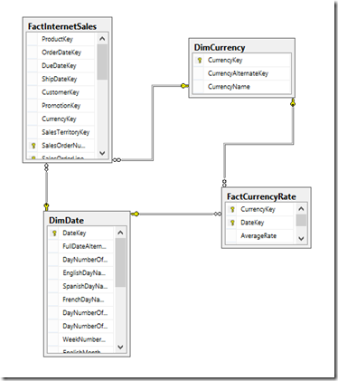
I am going to assume we are reporting off of a data model that is structured like the below, which lends itself well to currency conversion: (shamelessly lifted out of Adventure Works)
image

I’ve created my data source, my data source view, and 2 dimensions (currency and date). I’ve also created a small cube containing the sales amount from the FactInternetSales table and the FactCurrencyRates. In this model, we are collecting data in multiple currencies and want to convert it to a base currency of USD for reporting purposes. Let’s create our date dimension first:

image

Once you’ve created the attributes and hierarchies for the date dimension let’s tell AS MD that this is our date dimension, by clicking on the Add Business Intelligence wizard at the top left of the dimension designer and selecting Define Dimension Intelligence. On the next screen, select Time, then map the attributes of your date dimension to the corresponding attribute type.

Once that’s complete, create a currency dimension. The currency dimension should consist of at least the currency key and name. For more efficient storage on disk, for the key column, use a key column of the currency sk of the dimension and use a name column of the currency name. Since there is a one to one relationship between the 2 in the dimension, this will make it much faster for AS MD to run through the indexes at query time. My completed currency dimension looks like the below. Make sure you go into the Define Dimension Intelligence wizard again, but this time select currency, and map currency name  to the currency attribute. Also in the currency dimension, select the currency attribute you created, and set the default member to your base currency (USD). The expression should look like [Currency].[Currency].&[100]. You always want to set the IsAggregatable property to false. For this dimension, you cannot create an ALL member, as summing across currencies doesn’t make any sense.

image

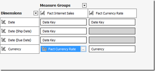
Now we’re ready to create a cube. Create the cube and select SUM for the Internet Sales In the cube, select the Internet Sales measure group and the currency rate conversion table, and change the currency rate measures for EndOfDayRate and AverageRate to LastNonEmpty. Then, move over to the dimension usage tab. ensure that the currency rate table is pointed to the date dimension, along with the date internet sales measure group you want to point to. My dimension usage screen looks like:
image

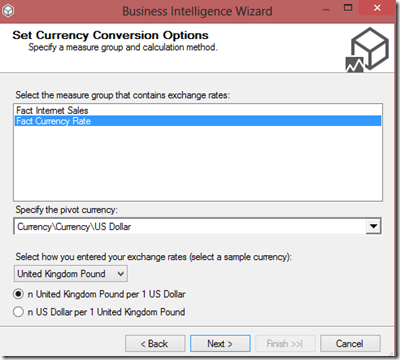
Now we’ll go back to the Cube structure, and add some currency conversion. In the Add business Intelligence icon at the top left, select Define Currency Conversion. On the next screen, we want to select our currency rate table, the currency we’re pivoting on (the one you want to be the reporting standard in a case of a many to one implementation), and whether it is in foreign currency per dollar or dollar per foreign currency.
image

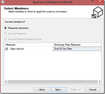
Click Next, and then select all of the measures that will be affected by the currency conversion:
image

On the last screen, select whether the conversion is one-to-many, many-to-many, or many-to-one. As many-to-one is the most common type of currency conversion requested, we’re going to select that here and select Next >

image

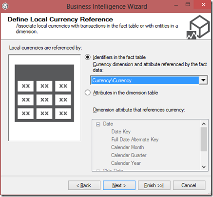
On the last screen, select the currency\currency dimension to specify that the fact table references the currency dimension directly, and select Finish
image

Click Finish again, and the wizard will run through. If you go to the calculations tab, you’ll see the script that the wizard generated:

// <Currency conversion>
        // Currency conversion wizard generated script.   
        // Currency conversion type: ManyToOne   
        // Selected members to be converted: Sales Amount   
        // Please be aware that any changes that you decide to make to it may be overridden the next time you run the Currency Conversion wizard again.   
        // All currency conversion formulas are calculated for the pivot currency and at leaf of the time dimension   
        Scope ( { Measures.[Sales Amount]} );
            Scope( Leaves([Date]) ,
                [Reporting Currency].[US Dollar],   
                Leaves([Currency]));

              // Convert Local value into Pivot currency for selected Measures that must be converted with Measure rate [End Of Day Rate]
              Scope( { Measures.[Sales Amount]} );
               This = [Reporting Currency].[Local] / Measures.[End Of Day Rate];
              End Scope;

            End Scope; // Leaves of time, source currency and pivot currency   
        End Scope; // Measures
        // End of the currency conversion wizard generated script   
    // </Currency conversion>

Also, if you go back to the Dimension Usage tab, you’ll see that the wizard has created a new dimension for the reporting currency. This is currency that the user will select to specify what currency it will be reported in. Process the cube, and we’re good to go!

Happy cubing!
SSAS: DistinctCount

As I’m sure all experienced SSAS developers have noticed, when you create distinct count measures in SSAS multidimensional, you are required to create a separate measure group in order to let Analysis Services identify these calculations easier. DIstinct counts are one of the most demanding requests that can be placed on a MOLAP database, caused by the large number of dimensional attributes that typically exist in a cube. I was recently reading the Analysis Services Distinct Count Optimization whitepaper by Denny Lee, and wanted to see for myself how changing the partitioning strategy for a distinct count measure group could affect performance, both from a processing and querying point of view. I enlarged the FactInternetSales table in AdventureWorks to ~1 million records, and took the existing Adventure Works multidimensional solution and just added my new big internet sales table into it. In full disclosure, the machine I’m working on is an Intel I7, dual-core, with 16 GB of RAM, and a 500GB SSD. I decided to run 3 tests, the first with the initial default partition, the second with 4 partitions, one for each year, and the third one creating equal distributions by the size of the table. Onwards!
To start, I’ve turned profiler on against my target server and created an 2 measure groups against my FactInternetSalesBig table, one calculating the sum of all of the sales amount and one doing the distinct count on my customerkey, representing the distinct number of customers. Below is the screenshot of the partition screen:

image

One partition results in the following query being sent against the database during processing, requesting an ORDER BY, as we’d expect.

        SELECT [dbo_FactInternetSalesBig].[CustomerKey] AS [dbo_FactInternetSalesBigCustomerKey0_0],[dbo_FactInternetSalesBig].[OrderDateKey] AS [dbo_FactInternetSalesBigOrderDateKey0_1],[dbo_FactInternetSalesBig].[DueDateKey] AS [dbo_FactInternetSalesBigDueDateKey0_2],[dbo_FactInternetSalesBig].[ShipDateKey] AS [dbo_FactInternetSalesBigShipDateKey0_3]
FROM [dbo].[FactInternetSalesBig] AS [dbo_FactInternetSalesBig]
ORDER BY [dbo_FactInternetSalesBig].[CustomerKey]
ASC

Additionally, this took 11622 milliseconds to process. What happens when we partition by year?

image

This time, profiler shows us the 4 separate queries being fired off into the relational database, each with their own order by statement. The longest partition, 2008, took 5111 milliseconds to process.

image

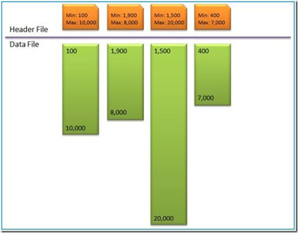
Our issue here is that when Analysis Services is reading from each partition, they are unequal in size, as evidenced by a graphic similar to the below:

image

pulled from the SSAS Distinct Count Optimizations Guide, written by Denny Lee


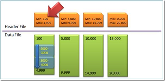
Grouping by year causes wide differences between the partitions files stored on disk, causing analysis services to read many more records for say, 2007 than 2005. We want to take this same data set, and group them into equal buckets each, in order to make it easier for Analysis Services to do the calculations at query time. Our ideal image should look like the below (adopted from the same source as the image above). This also ensures that AS only needs to scan each partition once, by creating non-intersecting partitions.

image

How can we ensure that partitions are of equal size? If we return back to our original table that is generating the fact, we can run a query like the below which tells us the min and max range of the table, as well as how many records should be in each group:

SELECT
COUNT (DISTINCT f.SalesOrderNumber) as CustomerKeyCount,
MIN(f.CustomerKey) as MinCustomerKey,
MAX(f.CustomerKey) as MaxCustomerKey,
(MAX(f.CustomerKey) – MIN(f.CustomerKey)) / 4 as CustomerKeySlice
FROM FactInternetSalesBig f

This table yields the following results in my big internet sales table:

image

In the fourth column of the select, I’ve hardcoded the 4, stating that I want to create 4 partitions. I’m now going to create 4 equal sized partitions in AS by creating each range, starting with the min value and incrementing by 4620 for each partition. Doing this takes 4883 milliseconds to process. The results can be represented via the following below graphic:

image

So, creating 4 equal partitions can help us scale our distinct count queries more and giving AS a really good performance boost when these queries come into play. Thanks Denny!

SSAS: Synchronize

As SSAS databases get larger and larger, deployment becomes a bigger and bigger problem. How can we ensure that databases are easily and quickly deployed across from development to production with minimal downtime? For some environments, SLA’s dictate that analysis services database must be available for querying 24×7, with seconds for downtime, especially for global companies. When it comes to deployment, there are 4 options to deploy: backup and restore the development database across, using the ssas deployment wizard, scripting the database using an alter xmla command, or using synchronize. backup and restore is slow and cumbersome, using the wizard is, well, using the wizard, and scripting the database with an xmla command is a decent strategy for deployment, although once you’ve run your script, the database needs to be completely re-processed before it can be queried again. In comes synchronize to the rescue! The beauty of synchronize is that while analysis services is doing it sync, users can continue to query and use the destination database. When the synchronize is complete, Analysis Services will automatically switch users over to the newly copied database, putting downtime for deployment in the millisecond range. This can be represented via the following diagram:

image

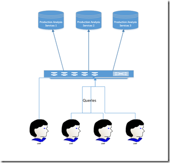
This ensures a high performing, scalable solution. Even better, we can use the synchronize command to synchronize production databases across instances in a Network Load Balancing cluster, and increase the resources available to analysis services as needed. For anyone unfamiliar with Network Load Balancing, you use a switch to distribute the workload across multiple smaller servers (scale out), similar to the below diagram:

 image

Additional information on scaling out an Analysis Services solution can be found here.

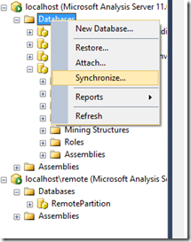
So, back to the reason for today’s post. Let’s say that we want to synchronize our Analysis Services database across from our development to our production machine. I have two Analysis Services instances on my machine, both 2012 SP1. In Management Studio, right click on the databases folder in the Analysis Services target instance and select Synchronize…

image

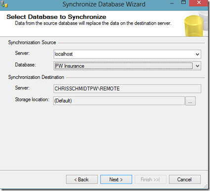
After the wizard introductory page, select the source and destination servers. Note that you also have the option to change the storage location on the destination server. (Remember, fast drives are better for heavily queried stuff, slow drives for older, less queried traffic). If the source server uses remote partitions, the destination server will point to the same remote partitions. For more information on remote partitions, see my previous post, Remote Partitions in SSAS.

image

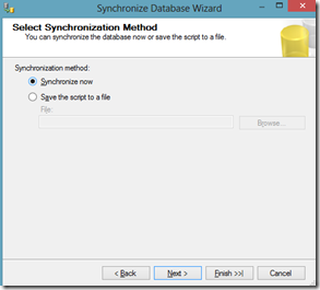
On the next screen, select the partition locations and click Next. Then choose if roles and members should be synchronized as well. If you are creating your roles initially you may want to deploy your roles and members, but once you’ve been in production for a while there will be a disconnect, as users have access to the production data but not the development server. We’re going to set it to copy all for this example. Notice the last checkbox, “Use compression when synchronizing databases”. We want to make sure this is checked, in order to keep time to a minimum. Click Next, and then select whether to synchronize now, or to save the script as a file. If you save it as a file, you can then take the xmla command and put it as a part of your nightly job run. We’ll keep it as Synchronize now, and click Next.

image

The summary screen will appear and we’ll click Finish. That’s it! You’ve successfully synchronized your two instances! I wanted to go into a bit deeper detail, so I’ve turned profiler on in my target instance before I click Finish so I can capture the commands being sent. Also, if you just want the synchronize script for your job, it looks like the below:

image

Once you click Finish, you’ll see the status bar tick across and do the synchronization between the two servers. My database was pretty small (93 MB), so it only took a few seconds. Below is a screenshot of the profiler events that I captured:

image

Selecting one of the Progress Reports that was logged, we can see that what Analysis Services that all Analysis Services did was copy of the files from the source to the target. There are no other commands being done (this line was repeated for every object throughout the database).

image

Keep in mind that this was an initial deployment. Running through the wizard again, this time the profiler shows us some profoundly different results:

image

It seems that when you are running the synchronize command, any subsequent runs against an existing database are compared to the existing metadata for differences (which would make sense, and you would expect that behavior). As databases grow larger, the impact of this will magnify, and slow performance down. For 90% of the solutions that I see on engagements, synchronize works perfectly like a charm. For larger (over a hundred GB AS databases), this approach may be able to be increased by using the technique outlined by using the Robocopy method outlined in this best practices article from Microsoft. Keep in mind that the Robocopy method demands that the service be stopped/restarted, and writeback and ROLAP support can’t be used). If you need those, using synchronize will be your best option.